

Best Practices for Designing Buttons
Our job as designers is to make sure that the user's decision is a simple process.

Designing a visually appealing button might seem like a straightforward task—fire up Figma, type in your label, apply auto-layout, toss in some fill, and if you’re a fan of rounded corners, a generous 8px radius should do the trick. However, the real challenge lies not in Figma or any of your favorite design tools, but in strategically placing these buttons where they wield maximum conversion power.
Anatomy
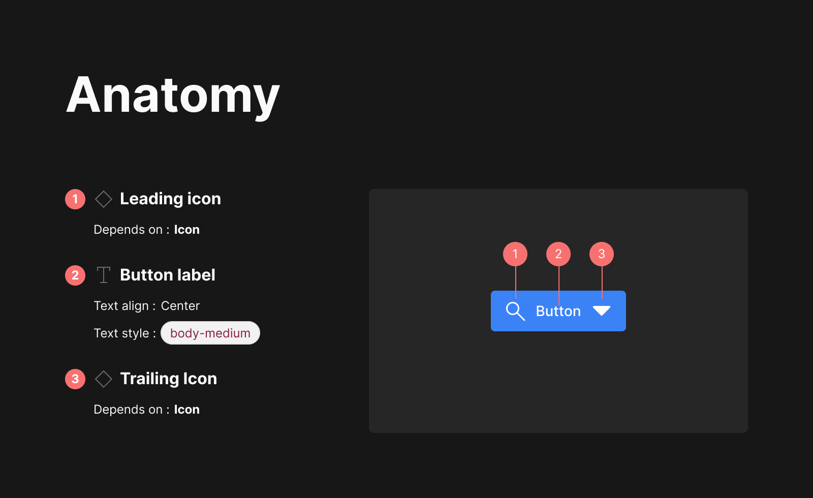
Leading Icon: Leading visuals offer meaning to a button label, such as a “search” icon next to the label for a search field submission. Leading visuals are always fixed to the button label, even if the button is full-width.
Button Label: Buttons should always be labeled unless they are just using an icon that is well-recognized and accessible. They can include an optional icon, but it should not be utilized for decoration. Use an icon only when necessary and when it is strongly associated with the label content. The label can be hidden to make the button just display an icon. If the label is hidden, an icon is required, and the label will be displayed in a tooltip.
Trailing Icon: Trailing icons such as dropdown carets are always locked to the end of a button, which is especially noticeable in full-width instances. When a button is a call-to-action, e.g. 'submit', its contents (visuals and label) are center-aligned within the button container. When a button is used to choose things like weeks, the contents (visuals and button label) are left-aligned within the button container.
Layout and spacing
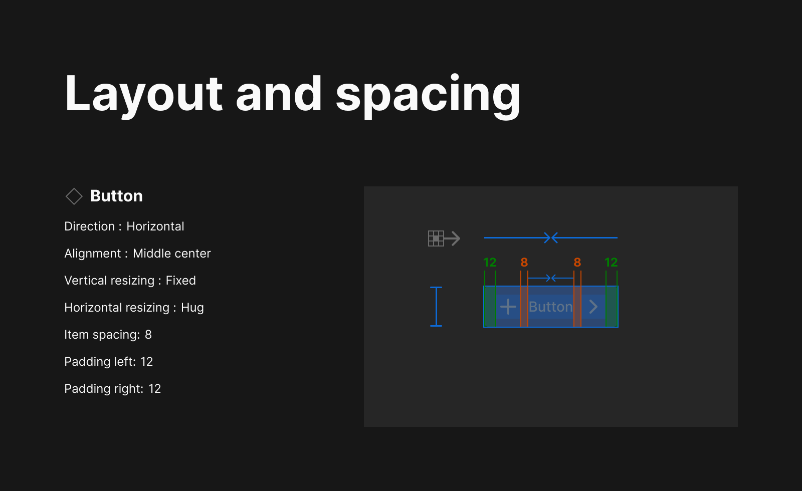
While creating my design system, the image above is a visual representation of how I use layout and spacing.
Note that the icon is designed using the Google 24px grid system, which provides additional 2px padding on all sides.
The button have a horizontal resizing of hug contents; this allows for the content to grow or shrink while still maintaining the default padding {gif of replacing button with another text}
Best practices
The following are best practices to ensure good button design:. While building the button for my design system project. I had to rely on industry standards and browse several design system documentations to see how they use buttons in their designs, leading me to have a list of so many industry standard best practices that I would love to share with you.
Hierachy

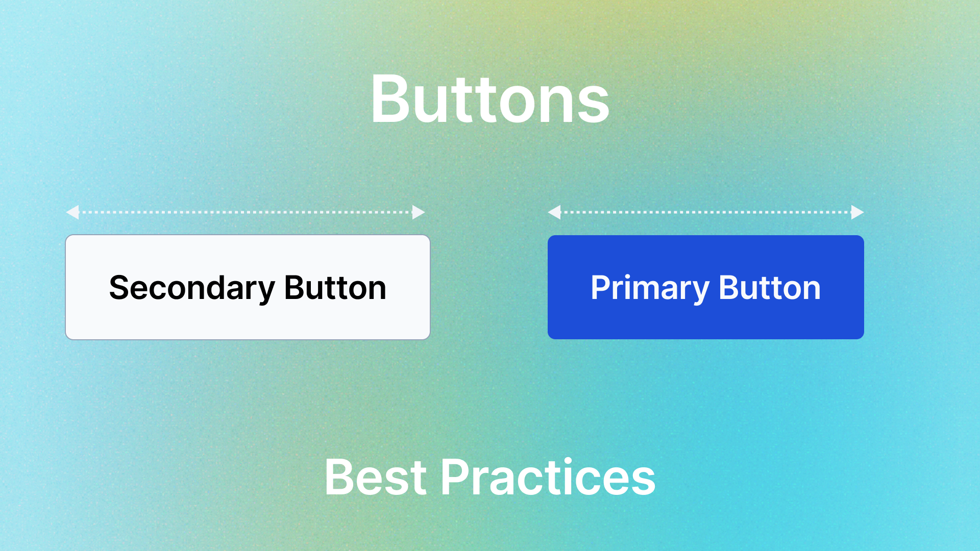
High Emphasis: Each screen should contain a single prominent button for the primary action. This high-emphasis button commands the most attention. The arrangement of on-screen elements should clearly communicate that other buttons are less important.
Medium Emphasis: A screen should contain a secondary buttton. This button should be a less prominent action.
Low Emphasis: A screen can have other buttons that have low emphasis. This can be optional, and the website can still work even without including them.

Button Placement

Do: Use a primary button with a secondary button; avoid using the same variant of a button at the same time.
Don't use multiple primary, secondary, or any multiple variant buttons together. Consider emphasis. And, as a rule of thumb, consider having one primary button per page. The primary button should be the most important action on the page.
Priority

Do: Place the primary button at the end of a button group, making sure that the primary button is at the end of the button group. (right)
Don't: On a full-screen, do not place a button with higher priority at the bottom.
States

Do: The button must stay disabled if the required user's tasks, such as user inputs, are incomplete.
Don't keep the button enabled if the required user tasks are incomplete. The user should't be able to proceed without completing a required task.
Text Formats

Do: Use sentence case for text labels. And it should be an action word (verb)
Don't use all-caps or other text formats for text labels.
Button Icons

Do: Icons can be used in buttons when additional clarity is rewuired and the icon is highly relevant to the action.
Don't: Only use icons when it is necesary. Icons should not be used for decoration.
Be Concise

Do: Button text should be concise: 1 or 2 words, no longer than 4 words, with fewer than 20 characters, including spaces.
Don't use punctuation marks such as periods or exclamation points. And your text should be simple and short.
Clearly state the action

Do: make sure that a button's label clearly states the outcome of the action. Use the same word or phrase found elsewhere in the experience.
Don't write ambigious text that doesn’t make sense at first glance to the user.
Use proper button variant

Do: Use the right variant to communicate meaning and hierachy.
Don't use a button variant for an action it's not intended for.
Conclusion
Buttons play a vital role in conversion process. Infact buttons are the first element that starts the conversion funnel process. Paying attention to the little details in designing buttons can make a huge difference. Buttons should guide not confuse.